Sara Marshall Imagines a Corporate World of Hand-Lettered Logos
Iconography is one of the most important facets of branding. Countless designers rack their brains
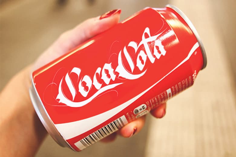

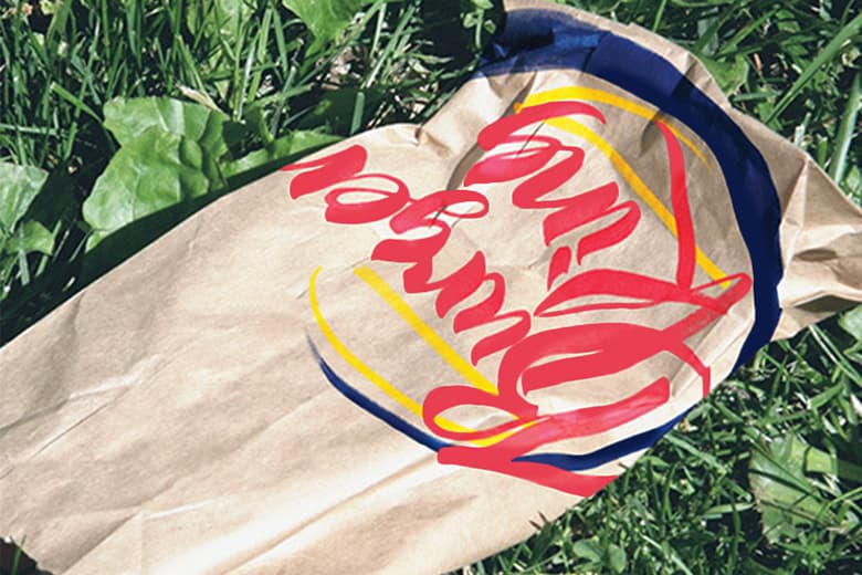
Iconography is one of the most important facets of branding. Countless designers rack their brains filtering through the infinite library of fonts and typefaces available, all in pursuit of making a distinct, meaningful impression on its audience. With this in mind, graphic designer Sara Marshall abandons all of that, instead re-imagining famous brand logos in her latest series: Brand by Hand. Considering the ostensibly timeless logos of Coca-Cola, Burger King, FedEx and more, Marshall created custom scripts based on each brand’s existing color palette, boiling each down to its essence. Ignoring the embedded geometry of each logo – for example, the arrow between ‘D’ and ‘E’ in ‘FedEx’ – Marshall’s experiment does well to test the associations we make with each identity. Check out some of her work above and head here to check out more over here.
