Pantone Names Two Colors as Color of the Year 2016
For the first time ever, the color of the year is a blend of two hues.
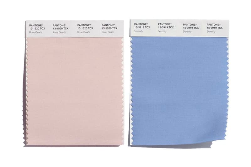
The Pantone Color of the Year has been revealed — and for the first time ever, it’s two colors, not just one. For 2016, welcome Rose Quartz (Pantone 13-1520) and Serenity (Pantone 15-3919). The former is a light pink hue while the latter is a pastel blue/purple color. The world’s authority on color has been crowning the “Color of the Year” since 2000, envisioned as a reflection of culture at the time. In 2000 the color was Cerulean Blue, capturing Y2K angst. Since then, Pantone’s color of the year has been an effective marketing ploy to keep the 53-year-old company relatable, with endless collaborations with companies such as Sephora and KitchenAid as well as commissioned murals from renowned artists.
These colors chosen were influenced by current events and the widespread discussions of gender. Read more here.
As consumers seek mindfulness and well-being as an antidote to modern day stresses, welcoming colors that psychologically fulfill our yearning for reassurance and security are becoming more prominent. Joined together, Rose Quartz and Serenity demonstrate an inherent balance between a warmer embracing rose tone and the cooler tranquil blue, reflecting connection and wellness as well as a soothing sense of order and peace.
The prevalent combination of Rose Quartz and Serenity also challenges traditional perceptions of color association.
In many parts of the world we are experiencing a gender blur as it relates to fashion, which has in turn impacted color trends throughout all other areas of design. This more unilateral approach to color is coinciding with societal movements toward gender equality and fluidity, the consumer’s increased comfort with using color as a form of expression, a generation that has less concern about being typecast or judged and an open exchange of digital information that has opened our eyes to different approaches to color usage.
